Illustrations :: Design
Web: click on an image below.
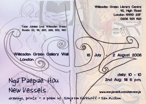
Print: >> CD covers, posters, colouring pages, etc.
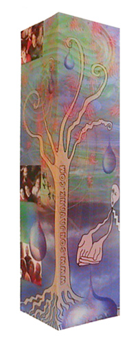
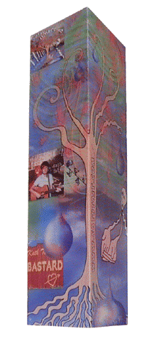
Bookmarker Designs
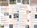
The bookmarker on the far left is my own promotional bookmarker showing my family, for personal use.
The other bookmarker was designed for the Kath Tait, a musician. It shows the covers of her 3 cds on one side and her website address on the other.
Each is 10 x 19 cm and plastified for durability.
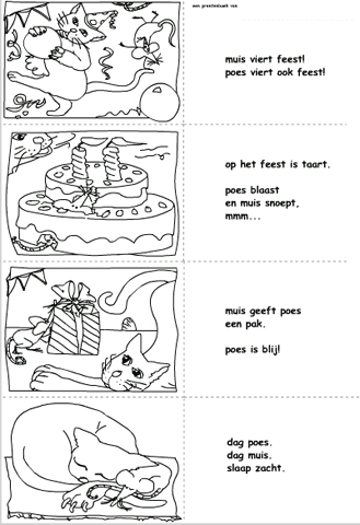
Story illustration
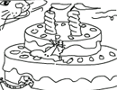
A short story about a cat and a mouse having a party written for 6 year olds.
It was made for the Dutch television programme website: huisje boomje beestje
as part of a game, where once all images are matched, the player can print this out, colour it in and cut it out to make their own story book.
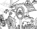
Colouring in pages for children
Colouring in pages for children
View some colouring pages here. Prices start at 200 euros each and depend on the complexity of the drawing required. All drawings are suitable for both print and web.
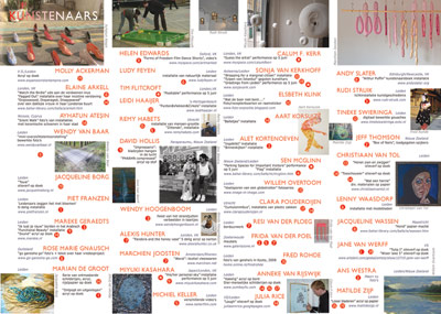
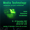
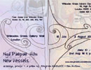
Folder Design for
an exhibition of 43 artists
Go to the website for larger views of the printwrok as well as for impressions of the show.
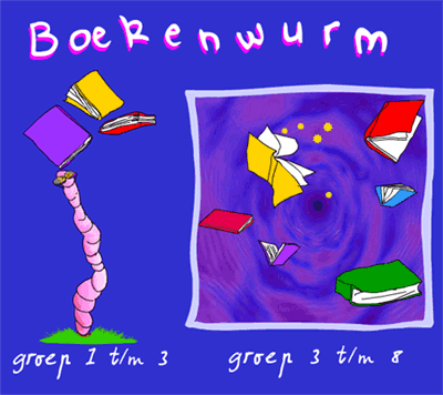
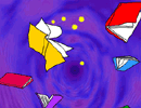
Styling for a website portal called "Bookworm"
One side is an image for a future website for younger children and the left is an animation where books open if you roll your mouse over them, revealing a particular television programme.
Every few seconds a worm passes through, unbalancing the books.
The assignment was for a playful design as an alternative to the idea that reading was a passive activity. View the animation in a new window.

