Websites for small or cms (database driven) websites
These days I design most websites using Wordpress (wordpress.com) and if needed teach the client how to make their own updates and changes once the design is finished. Email me with an estimate of your budget (must be over 400 euros) and what you want. Cheap deals involve using the free version of wordpress where the design possibilities are more limited but then there are no annual domain registration costs. Here is an example of a wordpress website I did the redesign for oswash.org.
>> No Flash: for cms use or no flash.
>> Website Designs: just layout
Redesign for a wordpress website / blog
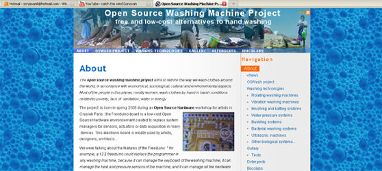
Redesign, June 2010

In consultation we came up with a more descriptive subtitle.
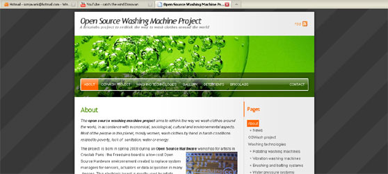
Above: The original blog which I imported elsewhere to redesign.
The approved design was then put into place without affecting the content: www.oswash.org
This was a 15 hour project involving the making of 3 images and working in css.
Website for an exhibition
I curated a show for the multicultural festival TamTam in Leiden.
The website had photographs of the various venues artists could make submissions for. Artists then downloaded a form and emailed their submission. Later, during the exhibition, images of the installations in these venues replaced original images on the website.
See it online at: www.sonjavank.com/tamtam
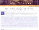
Website for an academic and poet
A website where each page provides an overview and access to all sections of the whole site via dropdown menus for items that can be up to three levels deep. The menu folds up afterwards. Many pages also have PDF files linked to them.
See it online at: www.sonjavank.com/sen
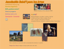
Website on the arts in Spanish
Asociación Bahá'í para las Artes
A website for the arts to compliment the English part of the same website I designed in 1999. Margie Díaz Mesén (Costa Rica) did most the translation of the material which was handled purely by email.
Each page links to the corresponding page on the English part of the website. Links to new artist pages are periodically added to the homepage.
See it online at: www.bahai-library.com/bafa
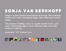
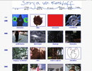
Website for an artist
For the homepage redesign in 2008: a grey page in flash. When you roll over an image, related text and images appear giving a quick impression.
The second image of thumbnails was the homepage made in 2002, which had a flash menu at the top added in 2006. This page is also accessible via a menu on each page of the website as the "thumbnails tour". The site can be navigated without the use of flash as well.
All project pages can be found by searching via the medium, date, the c.v., or "related" themes lists. So most pages have 4 different ways of being found.
See it online at: www.sonjavank.com
Website for a musician
The assignment was to make a simple and easy to update website.
It just has 4 pages where on the music page, pop-windows display lyrics, music and animations. The musician wanted a simple yet quirky feel, hence my use of the three snails for menu buttons.
The musician now manages the website herself with occasional help in coding. She has since changed the colours and there have been some changes to the layout.
See it online at: www.kathtait.com

